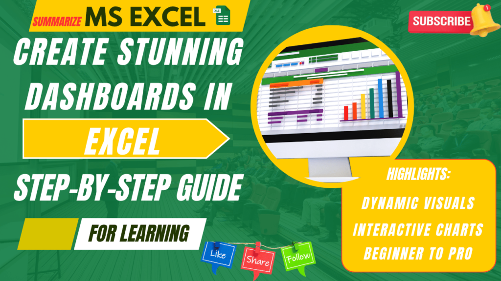
How to Make Excel Dashboards | Advance Excel complete guide | Techbikash28
In today’s data-driven world, professionals are constantly seeking better ways to present, analyze, and interpret data. One of the most efficient and widely used tools for this purpose is the Excel Dashboard. Whether you're a student, data analyst, manager, or entrepreneur, learning how to make an Excel dashboard can give you a serious edge in your career.
At Techbikash28, powered by Bikash Sarangi and Kalpavriksh Software, we’re dedicated to bringing industry-relevant MS Excel training to your fingertips—especially through our easy-to-understand tutorials in both Hindi and English.
Other Categories
📊 What Is an Excel Dashboard?
An Excel dashboard is a visual interface that summarizes large amounts of data into a single view using charts, tables, KPIs, and filters. It helps in identifying trends, tracking performance, and making quick decisions. Dashboards are used across sectors like finance, sales, operations, marketing, and more.
Instead of scrolling through multiple sheets or rows of raw data, dashboards allow decision-makers to interact with their data visually and meaningfully.
🧠 Before You Begin: Know Your Audience
The first step to building a dashboard is understanding:
Who will use it?
What decisions will it support?
What are the main KPIs or metrics they care about?
Example: A sales dashboard may focus on monthly revenue, lead sources, and conversion rates. A project management dashboard may focus on task completion, deadlines, and team performance.
🛠️ How to Make Excel Dashboard – Step-by-Step
1. Prepare Your Data Your dashboard is only as good as your data. Before doing anything visual:
Clean the data (remove blanks, correct errors)
Use structured tables (each column should be one data point)
Use named ranges and Excel Tables for dynamic references
3. Insert PivotCharts or Standard Charts Visualize your PivotTables using:
Column charts (for comparisons)
Line charts (for trends)
Pie charts (for distribution)
Donut or gauge charts (for performance metrics)
Format them with clean labels and minimal clutter.
5. Design for Clarity Your dashboard should be easy to read and understand:
Use consistent fonts, colors, and spacing
Align charts and KPIs neatly
Avoid too many elements on one sheet
Use white space effectively
Tip: Group similar visuals (e.g., revenue section, lead section) using colored boxes or background fills.
2. Use PivotTables to Summarize
PivotTables are Excel’s built-in tool to summarize large datasets.
Select your table
Go to Insert > PivotTable
Drag and drop fields to rows, columns, and values. Filter or group as needed
These tables become the “backend” for your charts and visuals.
4. Add Slicers and Filters Make your dashboard interactive:
Use Slicers to allow filtering by date, region, product, etc.
Add drop-down menus using Data Validation
Link slicers to multiple PivotTables
This lets users slice the data without modifying anything.
6. Test and Share Before you publish or share:
Click through all filters
Update some backend data and see if visuals update
Check for slow performance or lags
Protect the sheet if needed
Export it as PDF or Excel Template, or use Excel Online to share it live.
📽 Watch Our Free YouTube Tutorial on Excel Dashboards
Still wondering how to make an Excel dashboard from scratch?
👉 Head over to our YouTube channel – Techbikash28, where Bikash Sarangi explains step-by-step in both English and Hindi.
🎥 Video Link: [Video] 📌 Playlist: Excel Mastery Series – Kalpavriksh Software
Web Stories
💼 Real-Life Examples of Excel Dashboards
Our learners from Bhubaneswar, Mumbai, Delhi, and even remote parts of India have built dashboards for:
Sales and marketing analysis
Project tracking
HR onboarding and payroll
Client reporting in IT projects
Startup pitch decks using Excel visuals
With Excel dashboards, even small businesses can present corporate-level analytics without investing in expensive tools like Power BI or Tableau.
📈 Excel Dashboards: Key Benefits
🔹 Improves data analysis and visualization
🔹 Boosts your CV with advanced Excel skills
🔹 Saves time in reporting
🔹 Supports better decision-making in teams
🚀 Learn More with Kalpavriksh Software
We don’t just teach Excel—we teach real-world Excel. At Kalpavriksh Software, our mission is to make Indian youth job-ready with the most essential tech tools.
Explore other tutorials by Bikash Sarangi on:
Excel Functions (IF, IFS, TEXT, DATE)
VLOOKUP, HLOOKUP, XLOOKUP
Sorting, filtering & charting techniques
Excel tips for interview preparation
🌐 Visit: www.techbikash28.com 📱 Instagram & YouTube: @techbikash28 🎓 Training powered by: Kalpavriksh Software | Startup India Recognized
Conclusion
Creating an Excel dashboard isn’t just a skill—it’s a superpower in the digital world. Now that you know how to make an Excel dashboard, start practicing with your own data sets.
📢 If you found this guide useful, don’t forget to:
👍 Like our YouTube video
🔔 Subscribe to Techbikash28
💬 Comment your questions
💻 Bookmark techbikash28.com for weekly Excel blogs
🌐 Who is Bikash Sarangi?
Bikash Sarangi is a tech educator, automation expert, and the founder of TechBikash28, a platform designed to make real-world technology accessible. Recognized by Startup India, his mission is to simplify learning with tools like Google Apps Script, Power BI, Excel, and custom web applications.
From Bhubaneswar, Odisha, to learners across India and beyond, Bikash has created a strong following through practical tutorials, live training sessions, and custom business solutions.